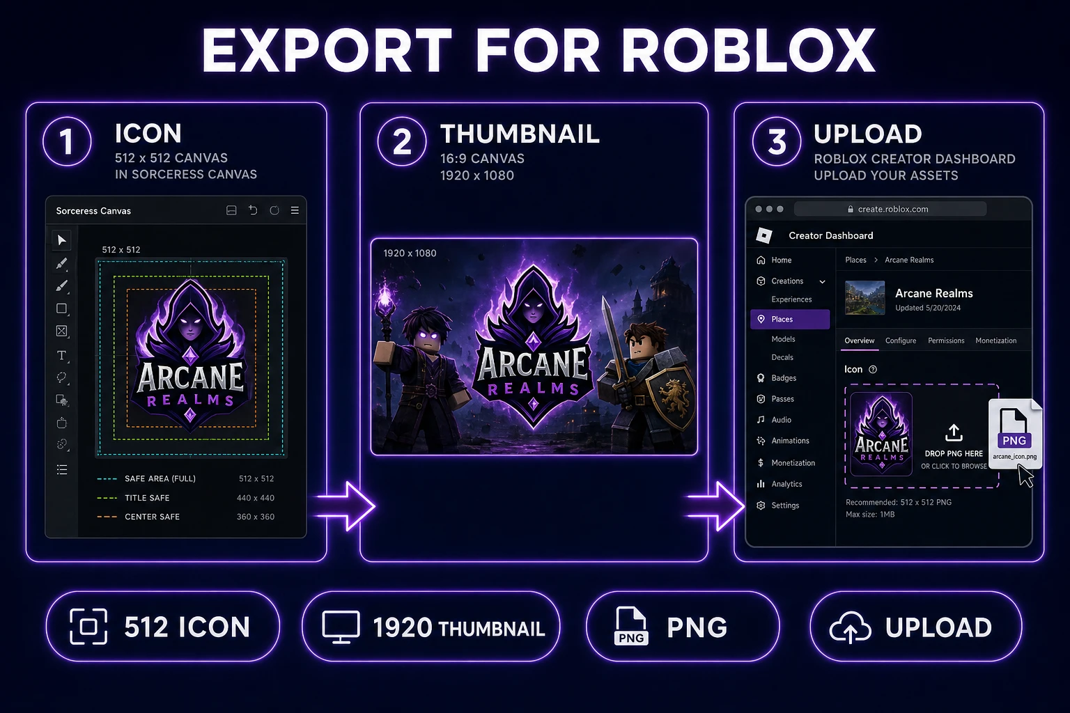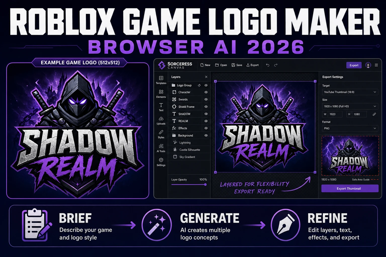
A Roblox game logo maker looks easy right up until you try to squeeze a legible wordmark into a 512-pixel square. This post lays out a browser workflow that respects the real Roblox specs first — a square experience icon at 512×512 and a 16:9 experience-detail thumbnail at 1920×1080 — then walks the four honest stages a Roblox logo has to survive: brief the concept, generate typography-safe rounds in AI Image Gen, finish in Canvas, and export both sizes for upload. Icon and thumbnail specs were live-verified on the Roblox Creator Hub on August 3, 2026. Sorceress model credits and Canvas presets were verified against the source on the same day.
What roblox game logo maker searchers actually want
DataForSEO lists roblox game logo maker at 210 monthly searches with KD 2 in the current supplement research pull. The verb maker matters. The reader is not shopping for a logo they can pull off a stock site — they want a workflow that produces one custom mark for the specific experience they are about to publish, at a resolution that survives the Roblox upload gate on the first try. That framing rules out generic online logo builders that spit out low-resolution SVGs, and it rules out chat-only image tools that hand you a 1024-pixel PNG in the wrong aspect ratio. The Sorceress tools guide lists the four surfaces this workflow needs: an image generator that can render text, a raster editor that can nudge kerning and add safe-area guides, and an optional agentic surface (WizardGenie) if you want the game and the logo briefed together.
The second half of the query is about identity. Roblox experiences live or die on a first impression from a 150-pixel thumbnail on someone’s home page. A logo built for print or for a Steam capsule will be illegible at that scale. So a real roblox game logo maker workflow bakes readability at small sizes into the brief itself: a two-word name in a heavy weight, one accent color, one recognizable silhouette, no gradients that fall apart when the icon compresses to a JPEG. Everything downstream (the AI rounds, the Canvas polish, the export presets) exists to protect that small-size legibility.
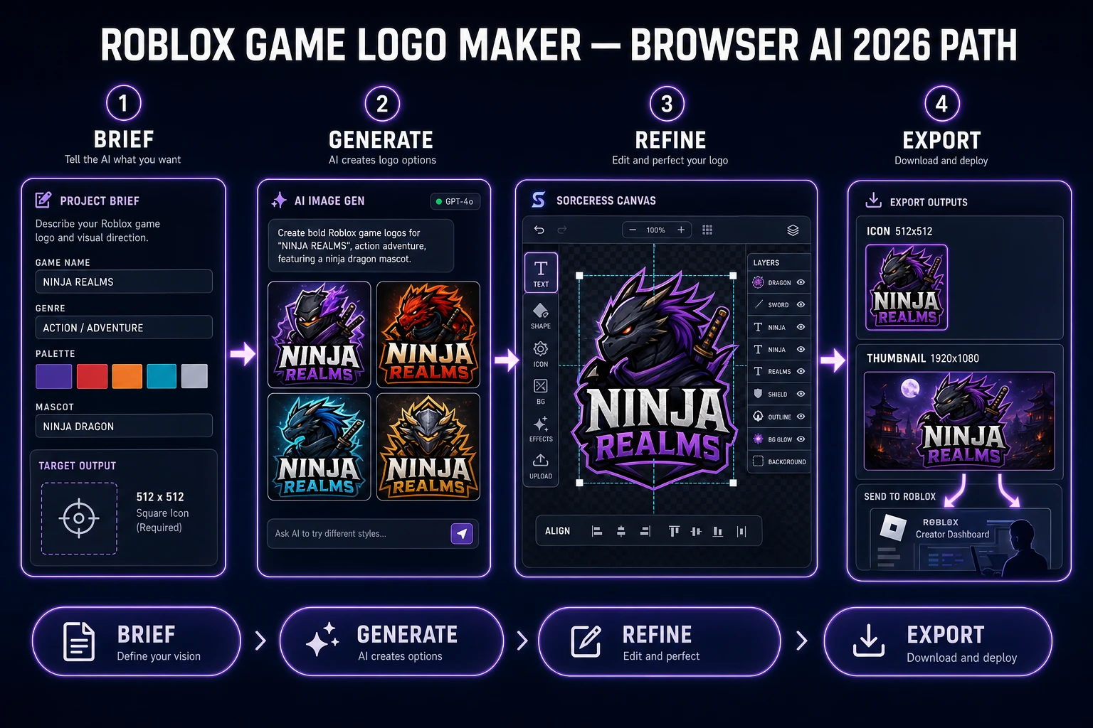
The rest of this article treats roblox game logo maker as one honest four-stage pipeline. It never pretends Sorceress uploads to your Roblox experience for you — that boundary stays on the Roblox Creator Dashboard, exactly as documented on the experience-icons page. Sorceress produces the file at spec; you upload it.
What a Roblox logo has to survive: the 2026 spec
Before you brief anything, pin the two output sizes. Skipping this step is why most first-try logos get rejected or look muddy on the home feed.
Icon spec, verified against the Roblox Creator Hub experience-icons page on August 3, 2026: the experience icon must be square and at least 512×512 pixels. The platform scales it down to 150×150 in home-page grids and 50×50 in some list contexts. Every element of your logo has to remain legible at 150 pixels. If your mascot is a cute animal with a lot of small features, you already have a problem — the ears vanish, the eyes turn into two pixels, and the icon reads as a generic blob at feed size.
Thumbnail spec, verified against the Roblox Creator Hub thumbnails page on August 3, 2026: a thumbnail image should be 16:9 aspect ratio and ideally 1920×1080 pixels, kept under 3 MB, in one of .jpg, .gif, .png, .tga, or .bmp. Up to ten thumbnails can live on the experience detail page, and Roblox rotates them for personalization if two or more are active. So a Roblox game logo maker is really a two-format job: one square icon, one wide thumbnail, both driven from the same brief so the identity stays consistent across surfaces.
Two safe-area rules save an hour of rework later. First, keep the wordmark inside a 384-pixel square centered inside your 512 icon — that leaves room for the platform’s UI chrome to overlay corners. Second, keep the wordmark inside the middle 1600×900 window of the 1920×1080 thumbnail, and never place critical text along the bottom edge because the player-count and metadata pill will cover it. Both rules are downstream of what Roblox’s thumbnails guide calls “best practices” (checked August 3, 2026).
The Sorceress roblox game logo maker pipeline in four stages
The pipeline is deliberately short. A logo is a decision-heavy asset with a small pixel budget — more stages just introduce more places for the brief to drift.
- Brief. Write the four-row concept card (name, genre, palette, mascot) before you touch a model. Ten minutes.
- Generate. Run three or four batches on AI Image Gen with GPT Image 2 for text legibility, then optionally tighten the winning direction on Nano Banana 2 or Nano Banana Pro.
- Refine. Take the strongest generation into Canvas, add a manual wordmark, adjust kerning, place safe-area guides, and paint any small-size legibility fixes.
- Export. Save a 512×512 square icon PNG and a 1920×1080 landscape thumbnail PNG. Upload both to the Roblox Creator Dashboard yourself.
Each stage below spells out the exact prompt, click path, and pixel target. The pipeline is what makes it a real roblox game logo maker instead of a lucky one-shot — you can rerun the same four stages for every experience you publish and keep a consistent house style across them.
Stage 1 — Brief the logo before touching any model
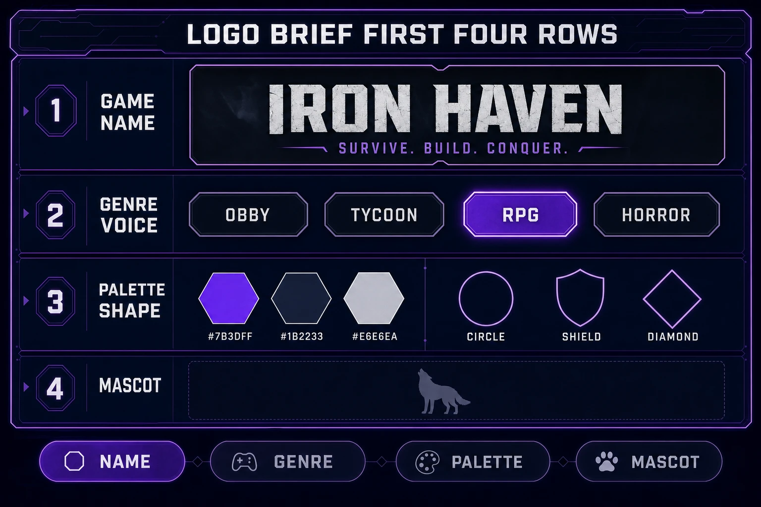
Open a plain text file or a Canvas note and write four short rows. This is your entire style guide for the run.
- Game name. Write the exact wordmark you want on the icon. If it is more than two words, pick the shorter phrase that still reads as your experience. “Skyshard Racers” beats “The Skyshard Rally Legends” every time on a 150-pixel icon.
- Genre voice. One line. Obby, tycoon, RPG, simulator, horror, roleplay — whichever fits. Genre picks weight (heavy sans for arcade, sharp serif for horror), palette temperature, and silhouette (round for cozy, spiked for combat).
- Palette. Three colors, in hex. One dominant, one accent, one contrast. Skip gradients until the base palette works, because gradients compress badly at 150 pixels.
- Mascot or shape. Either a simple mascot silhouette (a cat, a helmet, a diamond) or a strong geometric container (shield, circle, diamond, chevron). The rule of thumb: whatever holds the wordmark has to be recognizable when you squint at it from three feet away.
Every good brief carries a “what we do not want” line too. On a Roblox obby that line usually reads: no photo-real explosions, no lens flares, no clip-art trophies, no gradient-heavy backgrounds. Every negative you write here saves you a bad AI round downstream. A logo is one of the few assets in game dev where the classical definition from the Wikipedia entry on logos (a graphic mark identifying a specific product or organization) genuinely needs restraint — every extra element weakens the mark.